A successful presentation is all about your message. What you want to say. How you say it. How your audience understands it. How your audience will benefit from it.
Slides are not the presentation
The slides are a tool to emphasise or illustrate the key points of what you are saying. No matter that you are using the latest outstanding template for PowerPoint or Keynote, just the slides without your message is useless.
You shouldn't give people a copy of your slides if they ask for it. If you need to have something physical to give away then create a separate handout or document. Better still, arrange for your presentation to be captured on video.
Do you even need to create slides? Yes, we think you probably should. A good set of slides gives some structure for what you are talking about. Think of them like the chapter headings of a book. Having the theme of each section visible behind you doesn't do any harm. It keeps the focus of the audience and ensures they always know what you are talking about.
Simple and successful
The simpler your slides are, the more clearly your message will be conveyed.
Bullet point after bullet point is boring. Actually bullet points are best to be completely ignored. Slides are a visual tool. The best slides have no text or virtually no text.
Everything on a slide should absolutely need to be there. Equally nothing should be included that does not need to be there. Don't just add logos or graphics for the sake of filling white space on the slide. White space is good. It makes everything else stand out and become important.
Memorable graphics
We said slides are visual. That means graphics can be more important than words. But it needs to be good graphics. Graphics that people will remember.
Try to be creative. There is an enormous choice of stock photos and images available now, a lot of it completely free and unlimited in use. The problem is that so many of these stock images are not realistic and obviously staged. If you want to talk about your team, or your office, or your product then go and take a real picture of it. With the quality of phone cameras now it's easy. It doesn't have to be perfectly composed or professionally edited. A real photo is genuine and personal to your presentation. And all the better for it.
Remember you only need to have an image or a photo when it is really needed and adds something to the slide. Gone are the days when every slide has an image because all slides need to have images. We'll say it again - everything on a slide should absolutely need to be there.
A word of warning about using cartoons. It's so easy to get this wrong. If the cartoon is genuinely unique and contributes exactly to your message then possibly, but otherwise it will just look cheesy and your audience will have probably seen it before.
Transitions and animations
Using a simple transition between slides gives a clear signal that you are changing from one message to another. However be consistent. Choose a straightforward transition and speed that you like and then use it throughout the entire presentation. If you use different transitions all the time it can look like you've just discovered this feature and want to use it as much as possible. Just keep it simple.
Animations are a bit like cartoons. They do have a legitimate place in a successful presentation but you need to take a lot of care to get them right. Only ever use an animation if it enhances the message to the extent that your meaning would be weaker without the animation. Otherwise it is just a distraction and reduces the concentration of the audience. For the same reasons, we don't recommend the use of sounds or sound effects either.
Focus on your message
It's vital to keep you audience engaged and focused on your message at all times.
The 6x6 rule
Each slide should have a maximum of 6 words per line, with a maximum of 6 lines of text.
It doesn't have to be 6x6; it could be 5x5 or 7x7. Same concept, just a different restriction on words and lines of text.
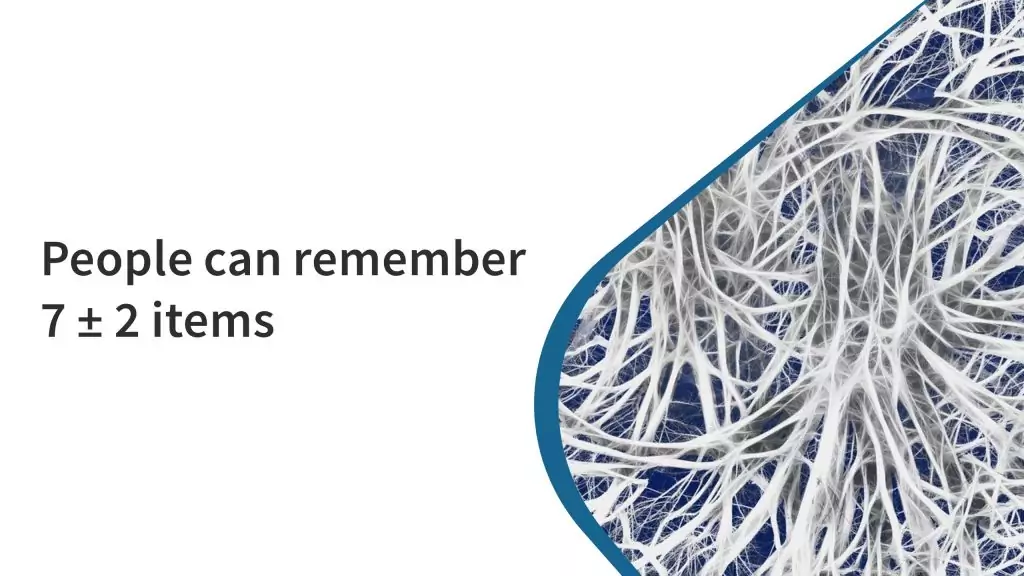
Where do these numbers come from? 7 is often regarded as the maximum number of things an average person can hold in their short-term memory at any one time. For some people it can be one or two things less. So to cater for most people, maybe we'll lower 7 to 6, or even 5. For discussion, we'll stick with 6. Present your audience with a maximum of 6 words at a time. We go along with that. It's a sensible maxim to follow.
The 6 rule
How about the second part of the 6x6 rule? A maximum of 6 lines per slide. This means you want to say 6 things that are maybe related to each other. Again that is perfectly understandable. But do you need to do it all on one slide? If you have 6 important things to say then use 6 slides. However if your 6 things are really closely related to each other then we would recommend it's enough to just use 1 single slide. With a maximum of 6 words on it. 6 carefully chosen words that present your message exactly.
"But how will people remember what I said if it's not on a slide?" Actually they are more likely to remember because it's not a slide. Why? Because they are listening to you and not just reading the slide. Everything they want to know is not on the slide, it's within the words you are saying.
So we won't call it the 6x6 rule. Just the 6 rule. A maximum of 6 words per slide.
The dramatic effect of a single word
How about taking our 6 rule even further. How about the 1 rule? 1 word per slide. Are we crazy?
Suppose we want to talk about the American psychologist George A. Miller. Amongst Miller's more famous works is his paper The Magical Number Seven, Plus or Minus Two which was published in the journal Psychological Review in 1956.
Imagine we are still fans of the 6x6 rule. Here's how our slide could look.

As soon as we put this slide up anything we say is being ignored. There are around 40 words on this slide and everybody in the room is now reading it. Or taking a picture of it on their phone. Or taking some notes. Whatever, but they're not listening. They also know what we are going to say. They know the end of the story and they're waiting for us to get there.
OK, we could use some animation. How about fading in the lines one at a time so there is less to read? Maybe the distraction will be shorter but there are still 6 lines, so now there are going to be 6 distractions. And 6 times the audience stops listening to us.
Now, would our 6 rule make things better?
Absolutely. There are now 80% fewer words to read. One simple message - really quick to read so the audience isn't really distracted much. But they still know the main thing we are going to talk about. They still know the punchline.
So try this instead.

Wow! Now they are interested. 7. Seven. Seven what? Wonders of the World? Deadly Sins? Dwarves? The audience doesn't know. There's nothing on the slide to tell them. But they want to know so they have to listen to you. You are the centre of attention. You know the answer.
The centre of attention
Still not convinced? Try this.
Watch a movie with the subtitles on and in your own language. Do you read the subtitles as soon as they appear? It's really hard not to. The artificially superimposed text on the scene immediately catches your eye and commands your attention.
As you are reading the subtitles how much are you listening? How much of the dialogue did you hear? How many tiny subtle details in the scene did you miss? The subtitles in a movie don't tend to match with every word spoken. When there is a lot of dialogue they are just a summary of what is being said. When there is little dialogue they sometimes appear before the actors speak so you get ahead of the story.
It's the same with a presentation. The instant you change the slide, or reveal another bit of a slide, or have some animation your audience will be distracted. Just like the subtitles, the audience will automatically read what's on the slide. If there is a lot of information they are also likely to have their mobile phones up in the air taking a picture of it. Your audience is not listening and you are no longer the centre of attention.
Presenting is not reading
However much information you decide to put on each slide, make sure you present it properly to your audience. Whatever you do, don't just read the slide. The audience will have already read it by the time you start speaking and it's so boring just to have you repeat what is there in front of them.
If you have difficulty remembering everything you want to say, or you need some prompts, then use the notes facility of the presentation software. The presenter view is different to what the audience sees. They get your simple, clear, unambiguous slide while you get to see your full set of notes. Of course you should avoid just reading it out but at least you can have prompts in front of you to aid and assist you.
Clear, concise and legible
We've been talking a lot about what to put on each slide. Whilst important, all those good practices don't really mean much if your audience has difficulty reading it.
Font size first of all. It should be obvious that it needs to be quite large. Especially if you are taking our advice about limiting the number of words on each slide. Guy Kawasaki advocates for a minimum 30 point font size. He has also expressed this as the age of the oldest person in the audience divided by two.
Then comes the choice of which font. In general sans serif fonts work best on screens. They are also the better choice for large font sizes. But with a massive choice of fonts available is there a "best font"? Probably not but this is an area where we recommend that you do not try to be creative. Stick to what is conventional, clear, legible and readable. There's nothing wrong with standard Arial or Helvetica. But there is a lot wrong with using some fancy decorative italic script that nobody can read.
Once you have chosen your font and font size be consistent. Use the same font throughout the entire presentation. You can put some bits in bold for some emphasis if necessary but you don't need any other effects. Also stick with simple left or right alignment. Centered or fully-justified text is much harder to read.
Light or dark
As with the choice of font, the choice of colour is also important.
Consider the lighting in the room you are presenting in. Where the room is well lit then your slide background needs to be a light colour with dark text. When the room is darkened, a dark background with light coloured text will be clearer for the audience. If you have a choice we recommend keeping the room lighting on as the screen will be easier to read. Leave the darkened rooms for the movies.
A few well-chosen accent colours can help your presentation, but again keep it restrained, simple and consistent. Too much colour is distracting. It's also vital you maintain a suitable colour contrast so that your presentation is accessible to your entire audience. More guidance on accessibility is available from the W3C Web Accessibility Initiative (WAI).
The power of charts
Charts and graphs are a powerful way to present a lot of information in a way that is concise and easy to understand.
To be most effective it's important to choose the best chart type for the information being presented.
Pie charts
Pie or doughnut charts are a perfect choice when you want to show the breakdown of some value into its constituent parts, for example as percentages.
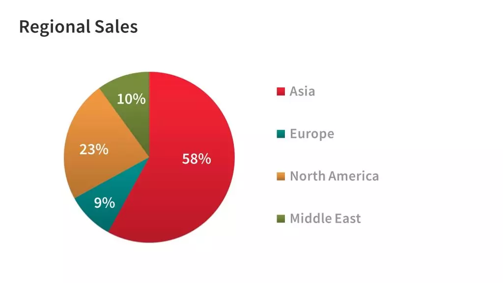
To be visually effective, the number of categories, or slices, should not exceed 5 or 6. Having too many slices makes the chart difficult to read and hard to understand. In the above example we are only showing 4 categories. Our choice of colour is also important. There is no ambiguity between the colour of each slice so it's clear what information is being shown.
Bar graphs
If you have more data elements to show than the 5 or 6 maximum appropriate for a pie chart, or you want to show the relation of data across two measures then a bar chart is more appropriate.
Bar charts also have the flexibility to be shown horizontally or vertically according to how you want the audience to understand the data.
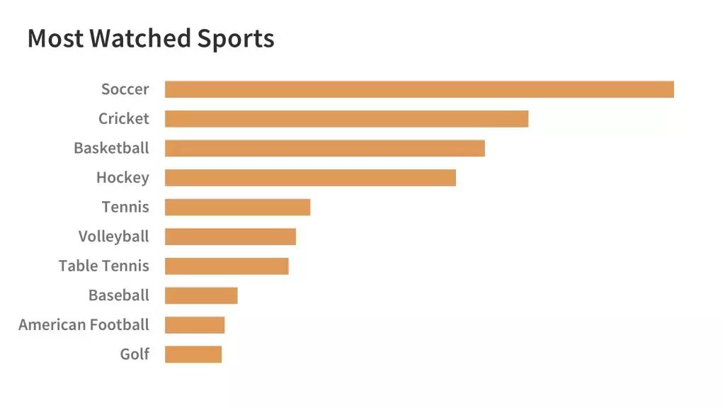
This horizontal bar chart example makes it clear which are the more popular sports. The larger number of categories make it more appropriate than a pie chart. The sports have also been sorted into most popular first to allow the audience to clearly make a comparison.
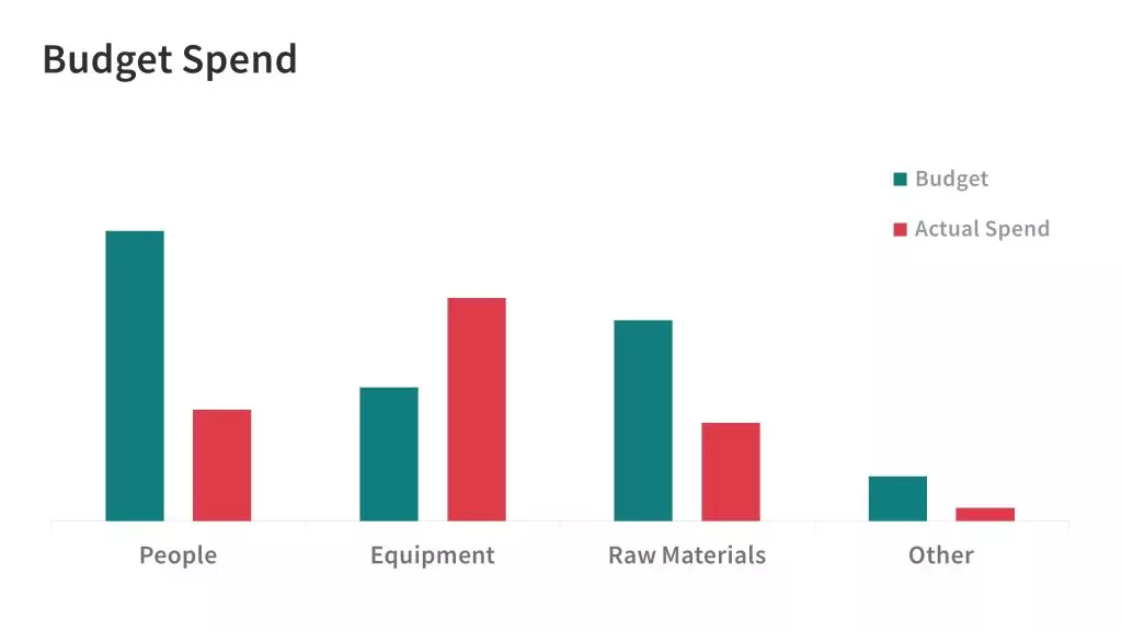
Vertical bar charts are useful for making comparisons between two different data sets. In this example it's very clear to see the actual spend against budget, and it's also immediately obvious that the spend on Equipment has gone over budget. Note that these charts have not been cluttered by having actual values. We want the audience to be able get a clear understanding without any effort.
Line charts
Line charts are a good choice when you want to show the trend of some information, or how some value is changing over time.
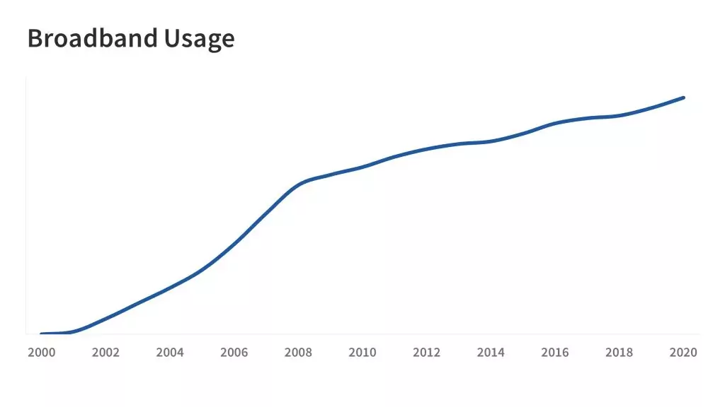
Once again we are not particularly concerned with showing detail on the chart. We are using a line chart to show a trend which is clearly understood by the shape of the line.
Tables
It's probably best to avoid tables in a presentation. Tables contain the facts but since they are not really visual they don't give meaning and it's hard to quickly understand what the data is saying.
Instead you should include the tables in any handout that accompanies the presentation so that your audience has all the facts but can study them in their own time.
Presentation template
Finally a successful presentation requires consistency. Each slide needs to look just like the others in terms of style, font and colour. To achieve this we recommend you use a template.
All of the example slides in this article have been created using our Geum Multipurpose Presentation Template which is available for both PowerPoint and Keynote.

Thank you for your comment.