Creating a project status dashboard? This flexible and sophisticated gauge is simple to create, effortless to update, and really looks the part.
Simple and clear
You've got your project status dashboard and you need to show some progress. Percentage complete of a task, resource utilisation, progress against budget, risks or issues. Doesn't matter what. You just need something simple that can be clearly read.

This type of gauge features heavily in our Elder Project Status PowerPoint Template. It's a great template, full of all sorts of clever gauges, dials and charts. So we thought you might like to see how we made one of them so you can use it yourself.
Our article Elder for Project Status Reporting describes how you can use this template for your own project status reporting. But don't be limited by that. This little gauge we're making has all sorts of uses.
A combination of charts
What you are seeing in this gauge is actually a combination of two charts. There's a dial underneath running from 0 to 100, and then there's a needle sitting on top to show you exactly where you are. To make it even clearer, the gauge gets filled in to match the needle. Finally there's a label showing the exact value the needle is pointing to.
We'll go through everything step-by-step. If something is not too clear, we're only too happy to help so please do contact us. More specific PowerPoint help and learning resources are also available should you need them.
Making the dial
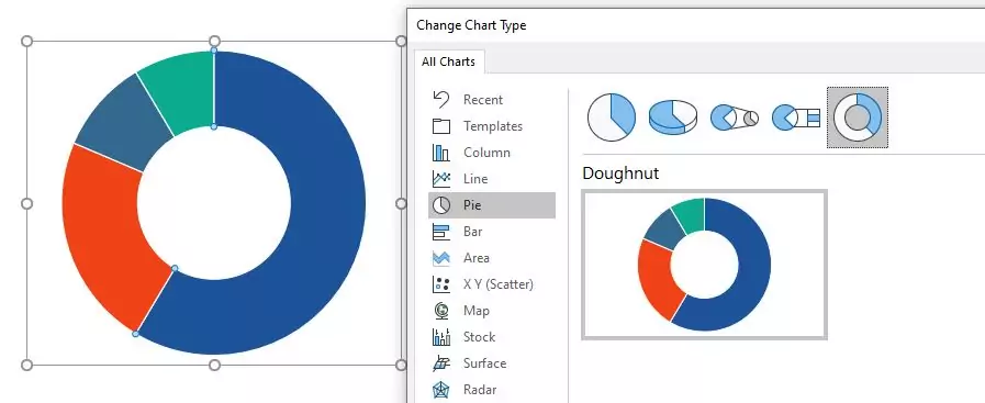
We insert a new chart, choosing Doughnut as the chart type, which you will find within the Pie category. By default PowerPoint has given us a sales chart with four different values. We've already deleted the chart title and legend as we won't be needing these.
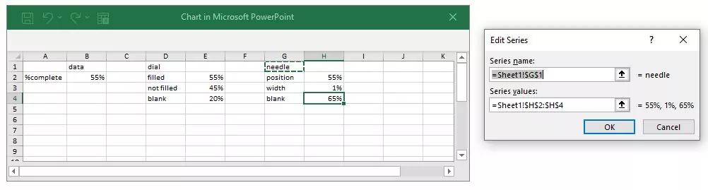
Setting up the data
PowerPoint uses an embedded Excel spreadsheet behind every chart to define the data. This means we can make use of Excel's power to simplify everything for our chart.
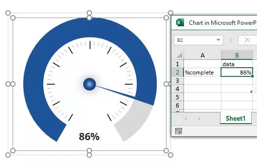
Our objective is to have one single, updatable value which will fill the dial, move the needle and show the value. Selecting to Edit Data in Excel we can set up our single %complete value.
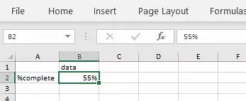
That is the single value we will only ever need to update in the future to change the gauge.
Let's go a bit further now and set up what will become the data series for the dial. Remember it's a doughnut which is just a pie chart with a hole in the middle. Pie charts need a set of data to colour in the various slices with. For our gauge we'll need 3 slices - one for the filled in part of the dial, one for the section of the dial that's not filled in, and another for the blank space at the bottom where the data value will go.
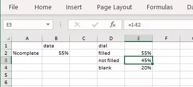
Our gauge is really a circle with 12 segments of which we use 10 to show the actual data. The blank bit for the data value takes up the remaining 2. So for 12 segments we want our entire dial to be 120%. 0% to 100% for the %complete value and another 20% for the blank portion. Making use of Excel's formulae we set the value of "filled" to be "=B2" to just copy the %complete value we will be updating later. "not filled" is then "=1 - E2" which gives us 100% minus the %complete. "blank" is just a hardcoded 20% as that's the size of our gap at the foot.
Defining the series
With the raw data in place, use Select Data to define the a new series for the dial.
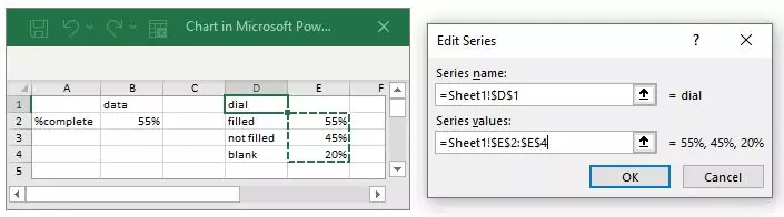
Simply set the series name so we can easily identify it later, and define the range of values that we set up earlier.
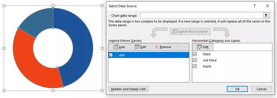
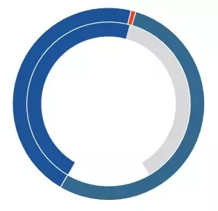
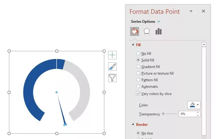
Now the dial reflects what we actually need in the gauge, although it doesn't quite look right yet. The bright blue colour is our "filled" section, the "not filled" section is red and the blank bit is the duller blue.
Formatting the dial
To make the dial look better we just need to do a few simple steps. Firstly change the angle of the first slice to rotate the dial around. A circle has 360 degrees so each of the 12 segments in our gauge takes up 30 degrees. Since the blank part of the chart is at the foot, we want the actual dial to start 1 segment, or 30 degrees, after the bottom. The bottom is at 180 degrees, so we want our dial to start at 210 degrees. Whew! Too much maths but at least it's obvious now which section is which. We also increased the size of the doughnut hole to make it look better.
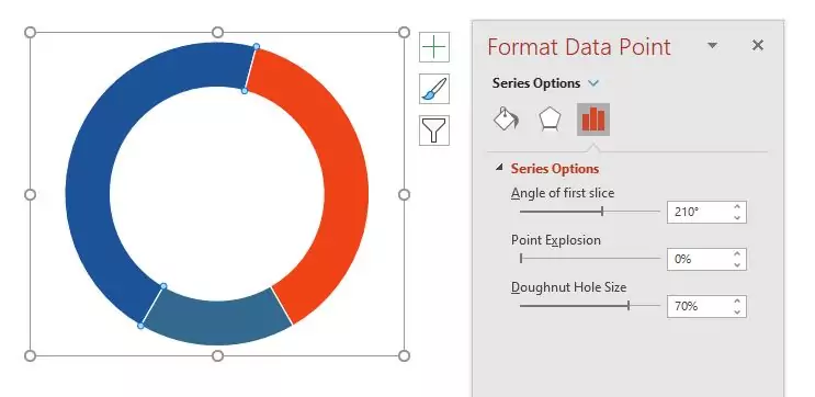
Now we just make some changes to the fill colours. Set the filled colour as we require, the non-filled colour to a light grey and removing the fill entirely from the blank section and we're done. The dial part of this gauge is finished.
Adding the needle
The needle is going to need another data series defined very similarly to that of the dial. Again, selecting to Edit Data in Excel we can set up the values.
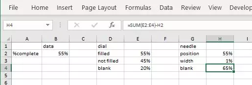
We're still dealing with the same 12 segment circle, so everything needs to add up to 120% as we defined it before. Another Excel formula sets the "%complete" value to be "=B2" to just copy the %complete value we will be updating later. "width" is the width of our needle. We use a hardcoded 1% since the needle should be nice and thin. Finally then, our blank portion is just the calculated difference between the full dial (120%) and our needle position.
Use Select Data for the chart and we can define the new series for the needle to use this new data. Exactly the same as we did it before.
Changing the chart type
Let's recap. We've finished off the dial and it looks exactly as we want it. And we've just added the needle, so everything should be looking pretty good right now.
Wow! What just happened? Don't panic. All that's happened is the needle series has been added using the same styling as the dial. So we've got ourselves a little stack of doughnuts. Tasty, but maybe not exactly what we wanted for our little gauge.
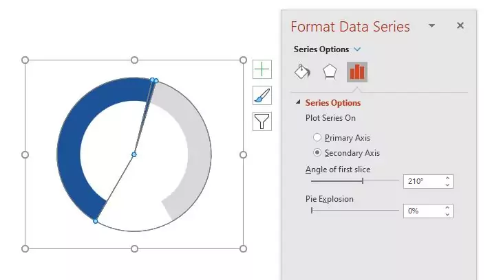
Select to Change Chart Type and let's get it fixed. Change the needle to be a Pie chart, and put it onto the secondary axis.
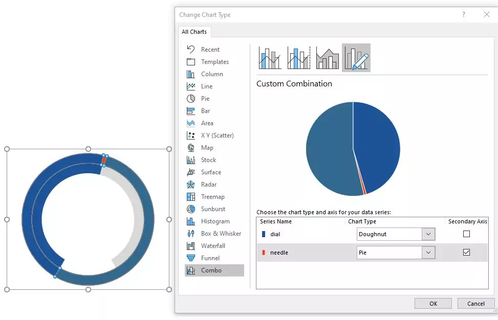
Once we confirm that change will that fix everything?
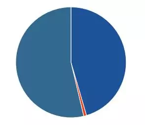
Now it's worse! The dial has gone and we've got a massive pie instead. Equally tasty but not at all what we want. Remember you're supposed to be not panicking. We still have to format it just like we did for the dial.
Fixing our needle
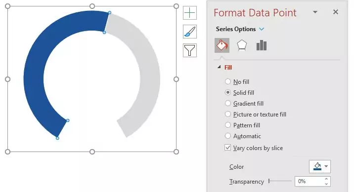
We'll change the colours first this time to give you some reassurance that it's not all broken. This time the only part we want to be coloured in is the needle, so we set the %complete and blank sections to be No fill and colour in the needle to match the dial.
Happy now? Almost, all we need to do is rotate everything around so that the needle starts in the same place as the dial. 210 degrees if we remember correctly.
Showing the value
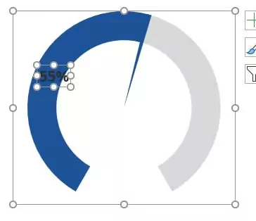
We're getting there. Now to add some text to show the current value the gauge is showing. For this we'll use a data label, but only on the %complete of the needle data series. Selecting just that segment we add data labels as a new chart element.
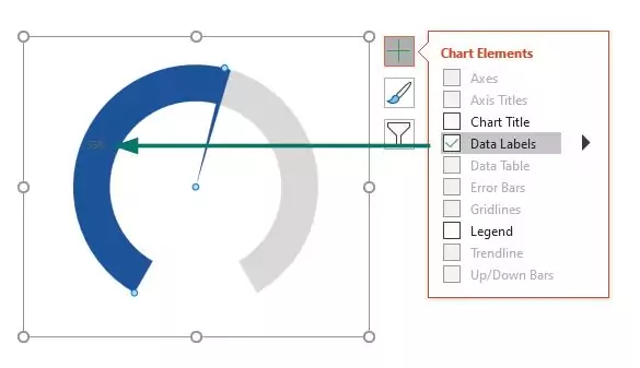
So where's the value? It is there, but by default it's in a faint font colour, pretty small, and right in the middle of the segment. We added an arrow to the image above so you can see it.
We can make this better, but firstly a little preparation. By default even though we've defined a nice big area for the chart, only the bit the middle is being used. To fix this, select the plot area and drag it out to make it as big as you can within the chart area.
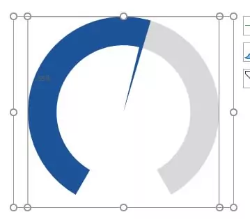
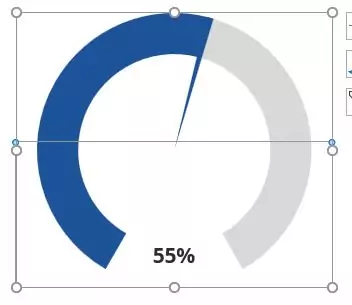
Now we can move the label. Start off by changing the font size and colour to something more appropriate. Something we can at least see.
Select the label and drag its container out to the full width of the chart area, and move it down to the foot. You want to make sure the label area is taking up about half of the height of the chart area and is stretched all the way down to the foot. That way the label position will stay fixed regardless of the value of the chart.
Decoration and cosmetic details
That's the gauge done in terms of functionality. All we want to do now is add some decoration and make it more individual than PowerPoint default.
A little circular shape for the centre of the dial and a set of marks and we're done.

One click update
Now we've got our gauge we can use it as we wish. Everything is defined to hinge off that single %complete value. Change this one value and everything is updated; dial, needle and displayed value.
It really couldn't be any simpler.


Thank you for your comment.